


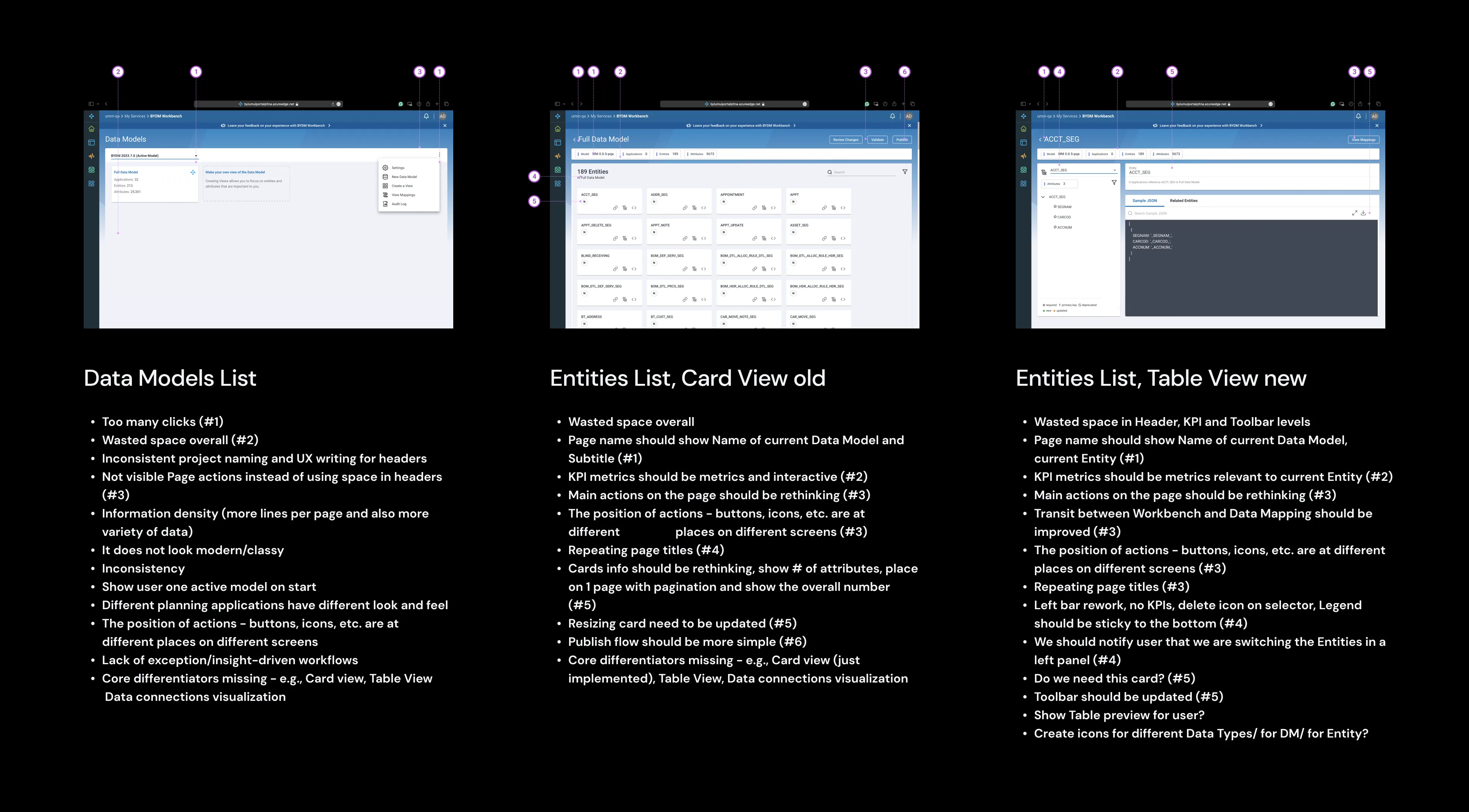
Heuristic evaluation
- Excessive clicks.
- Overall wasted space.
- Inconsistent project naming and UX writing for headers.
- Page actions are not clearly visible, occupying unnecessary space in headers.
- Insufficient information density and lack of data variety.
- Outdated appearance.
- Inconsistencies throughout.
- Varied look and feel across different planning applications.
- Inconsistent placement of actions like buttons and icons across screens.
- Lack of exception-driven workflows.
- Missing core features like Card view, Table View, and Data connections visualization.
Validation with users
- Validate by planning, collecting, analyzing, and interpreting data.
- Assess results, refine assumptions, and iterate hypotheses.
- Test by planning, collecting, analyzing, and interpreting data.
- Validate by evaluating results, refining assumptions, and iterating hypotheses.
- Thoroughly plan, collect, analyze, and interpret data to validate hypotheses.
- Plan, collect, analyze, and interpret data to validate hypotheses.
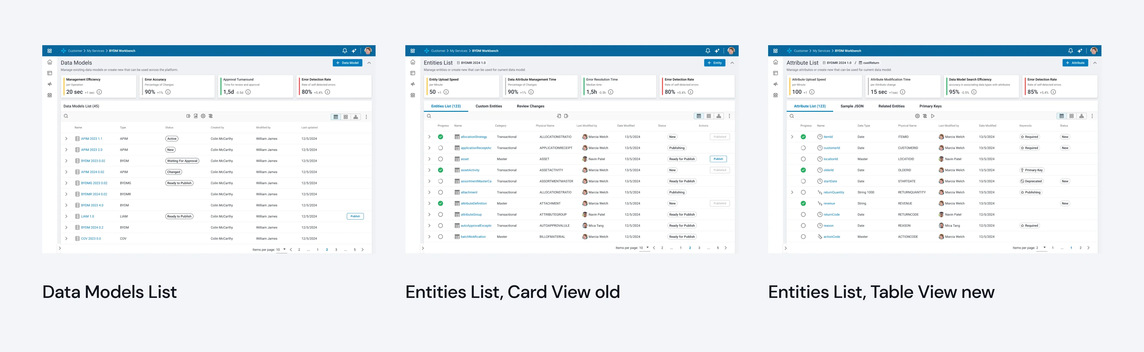
Concept creation
- Introduced interface statuses.
- Converted selector and card view to default table view for consistency.
- Ensured uniformity across pages using Platform design system components.
- Added tooltips and icons for clarity on specific terminology.
- Enhanced navigation by displaying hierarchy.
- Streamlined all processes.
- Revamped alert system and associated flows.
- Implemented user onboarding.
- Optimized empty space.
- Reduced the number of clicks required.
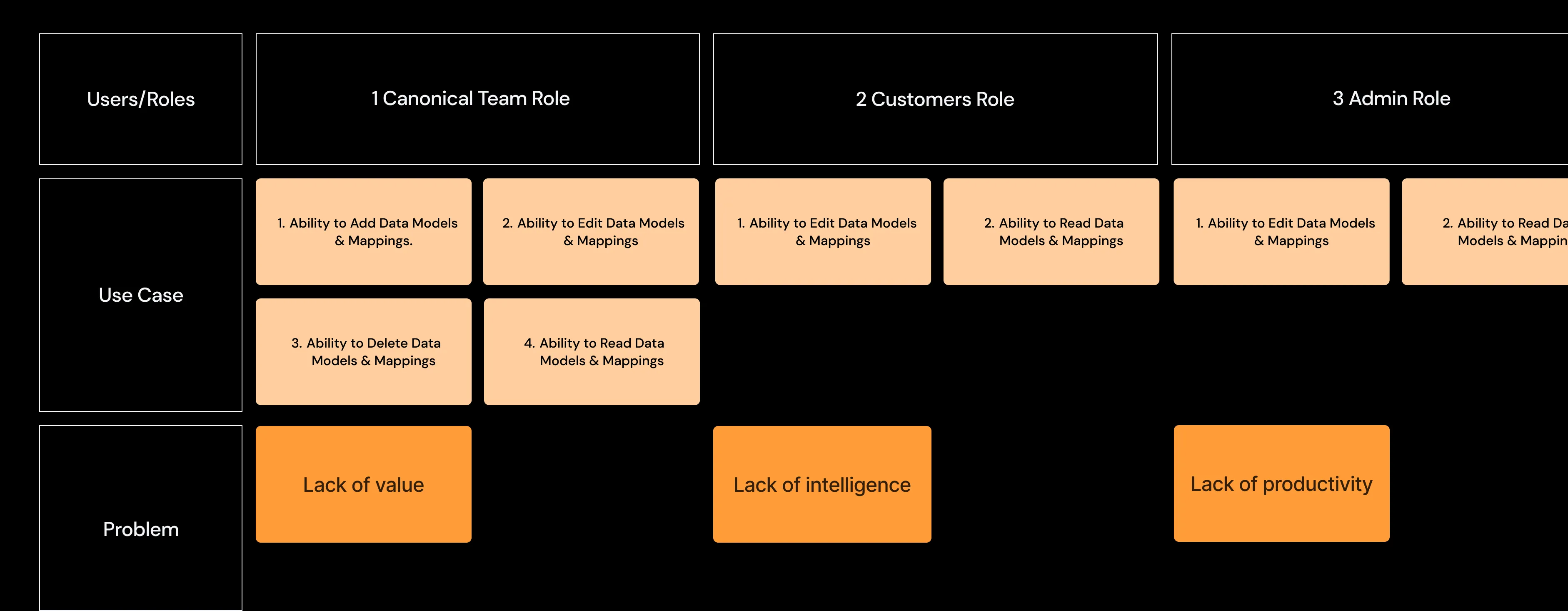
User acceptance test
- Early detected of issues.
- Fresh perspective.
- Real-world environment.
- Broad testing scope.
- Mitigate risks pre-launch.
- Objective feedback.